PROJECT OVERVIEW
In this UI/UX design, I was tasked with creating a Flight Information Display System (FIDS) for the Hartsfield-Jackson Atlanta International Airport (ATL) that would primarily be viewed on an iPhone 14/15 Pro. Below is my process on how I came up with my final interface and how my chosen audience impacted my choices.
RESEARCH
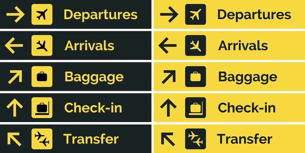
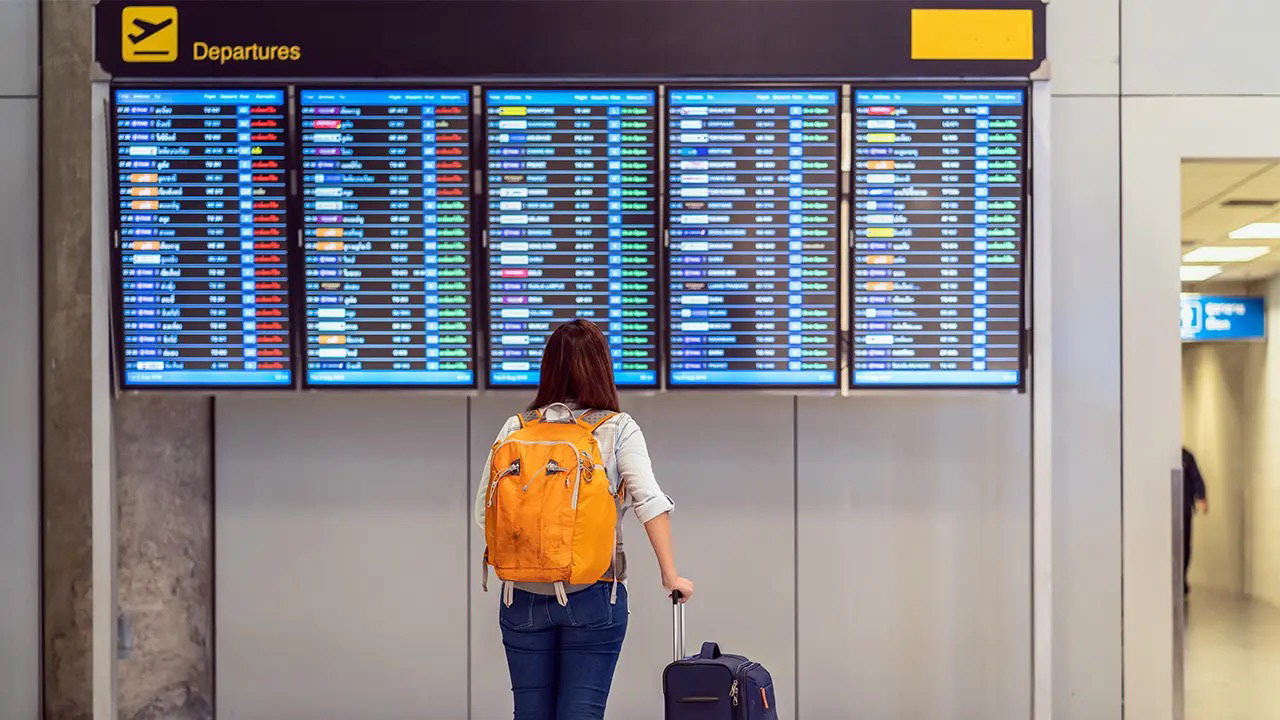
To get an idea on what current interfaces look like, researching various designs not only gave me a reference, but gave me ideas on how they could be improved.
TYPEFACE EXPLORATION
Going into this project, I knew about the stress and chaos that airports can create. Whether it be long lines at security, struggling to find your gate, or even racing against time to board your flight. I wanted to design an interface with a calming appearance that presents its information in a clean, organized way. Choosing the proper typeface was essential.

COLOR STUDIES
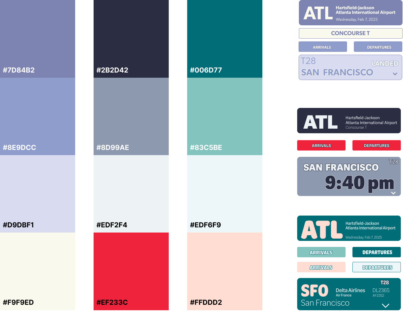
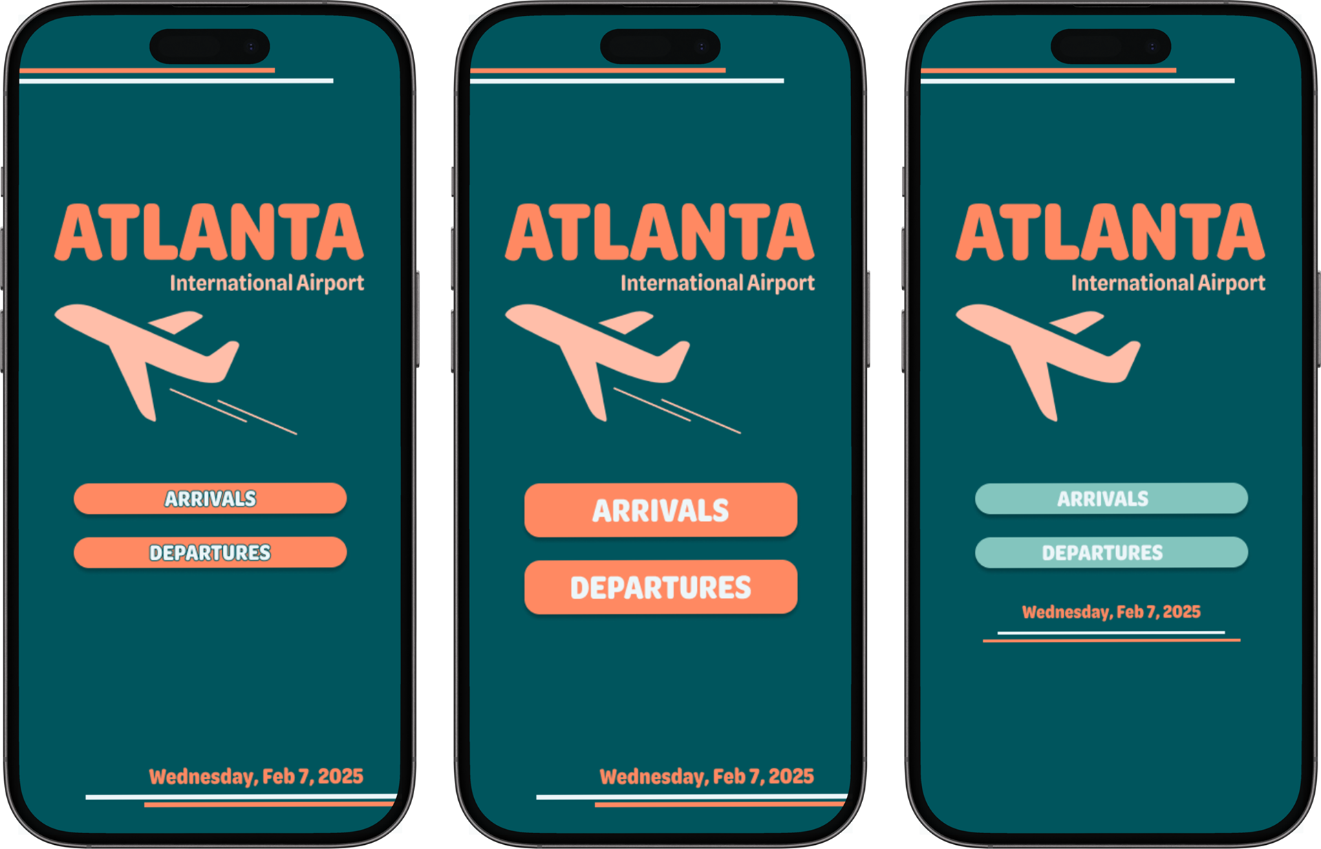
IDEATIONS
Exploring different color pallets as well as type allowed for me to get an idea on what would communicate best with an audience that needs a calm, clean interface.
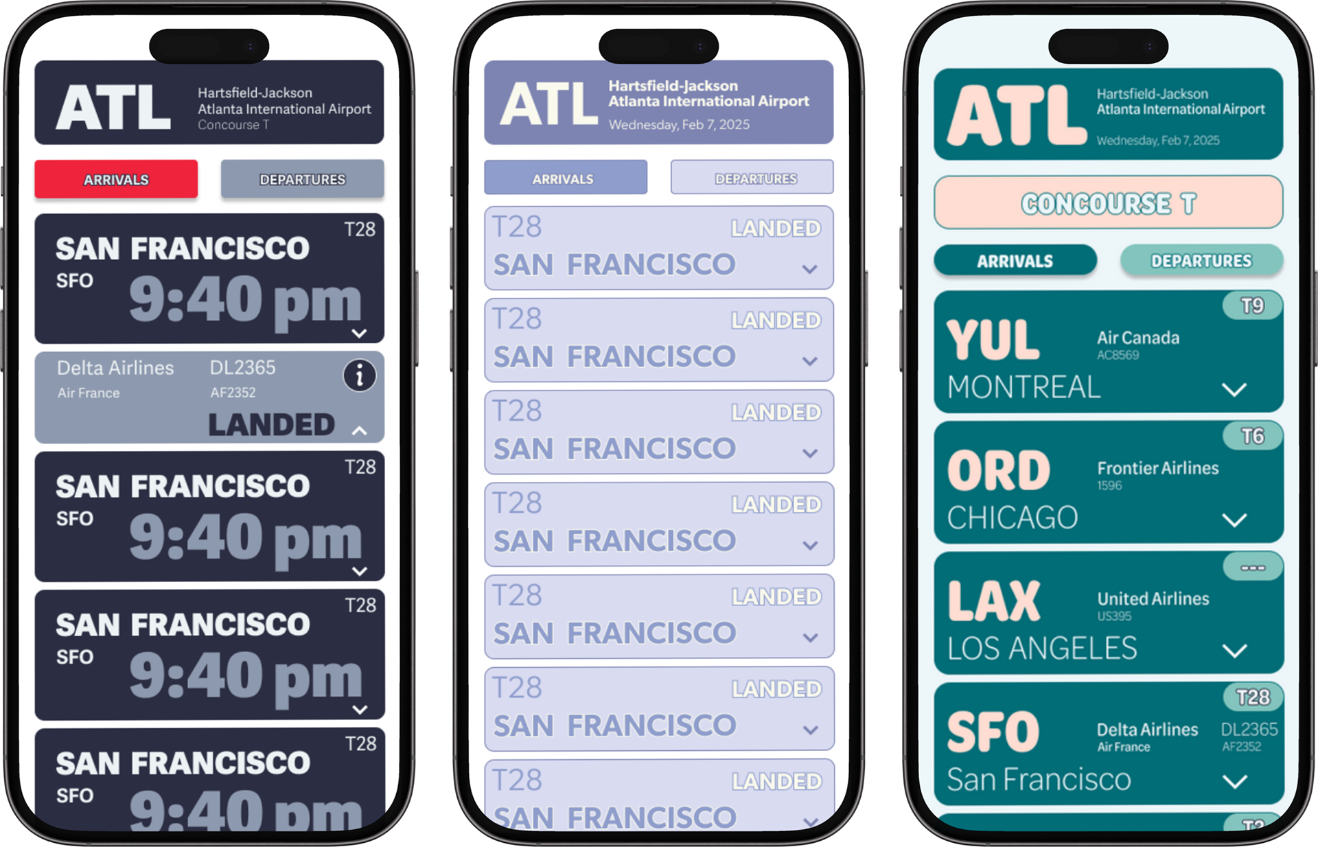
ITERATIONS
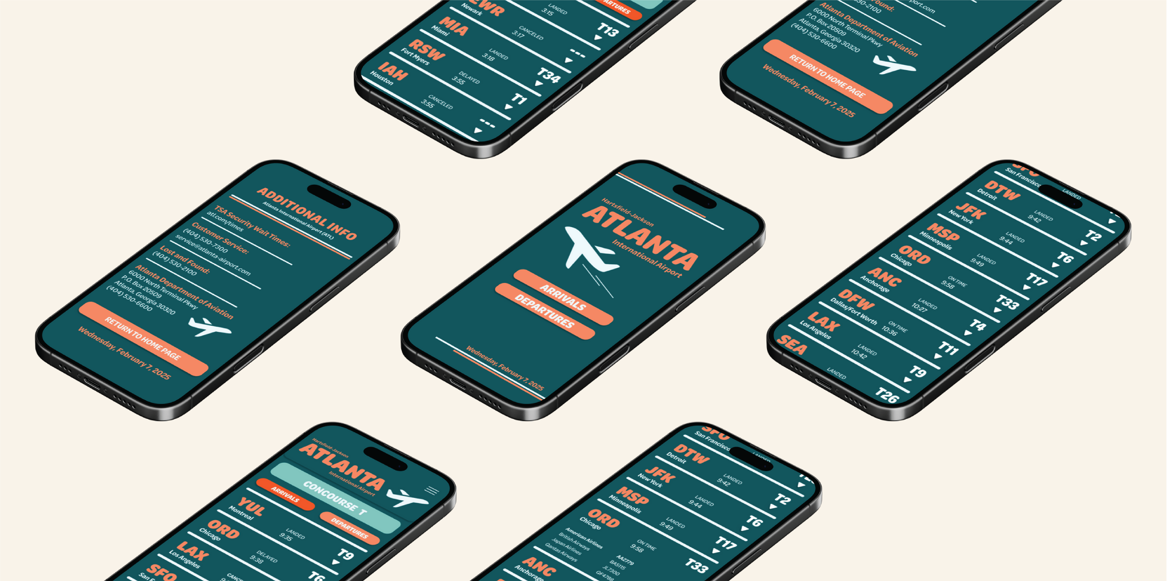
The screens below are the different categories of information that need to displayed in the overall interface. These are the additional info screen, arrivals, and departures. At this point, I had settled on my typeface, but needed to make some changes to the colors and layout.
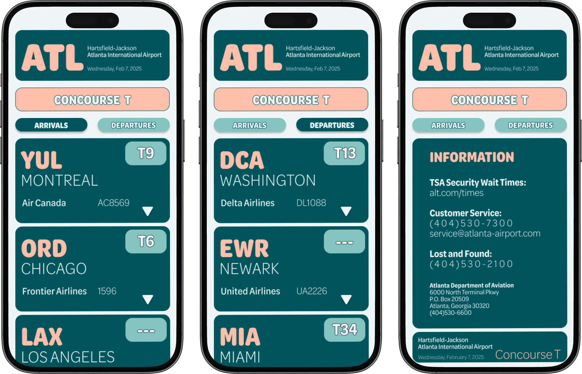
refinements
This was the point where I had a very strong sense of the direction I wanted to go in, but knew that I needed to make some adjustments. Biggest takeaways from classmate critiques was that some of the type was too light and too thin. Also, making the colors a bit darker would add a much stronger contrast.

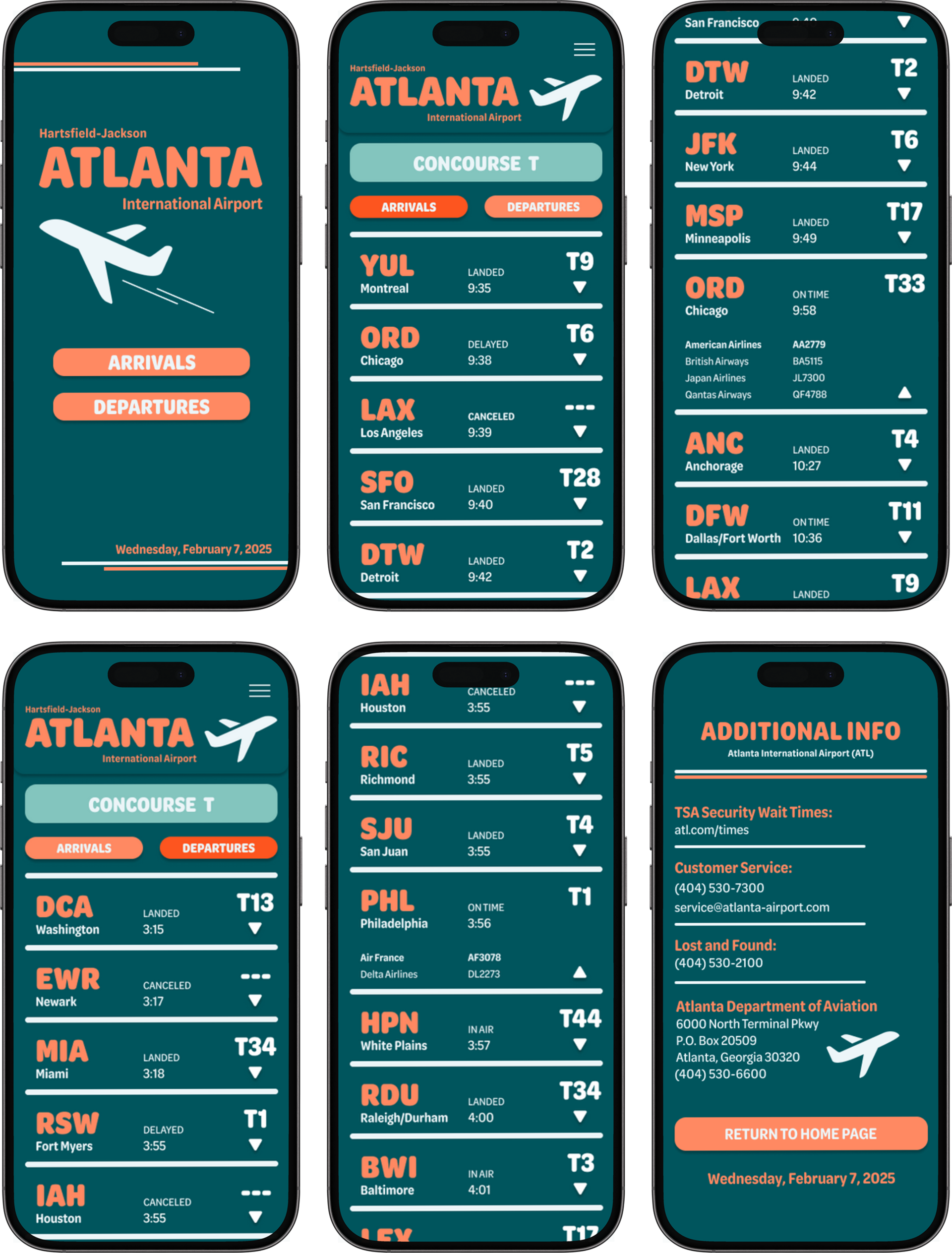
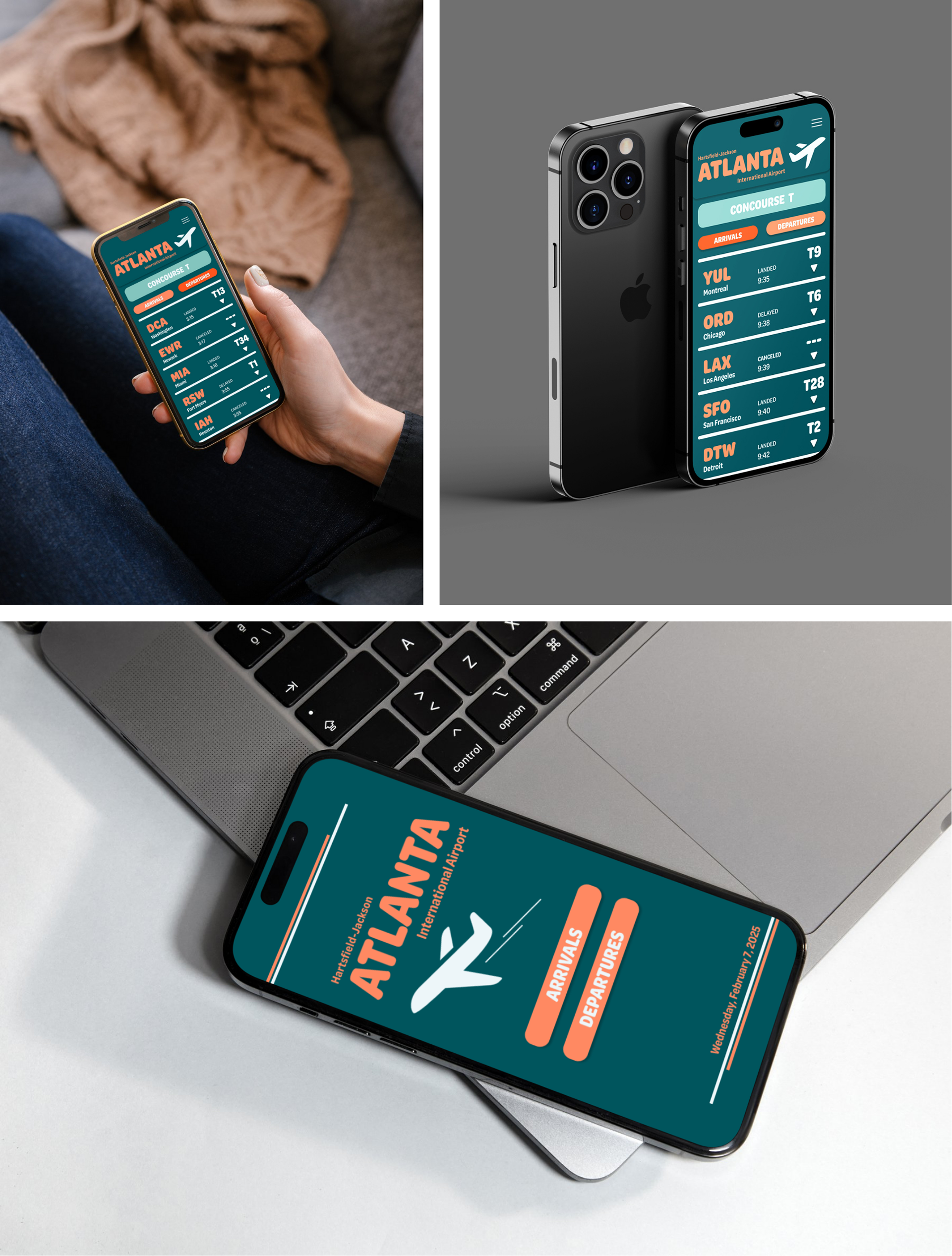
FINAL INTERFACE + PROTOTYPE
Adding the darker colors allowed for the priority of communication (hierarchy) to be more prominent and increasing the type weight and size made for stronger readability. Below is a video walkthrough of the app itself once prototyped in Figma.