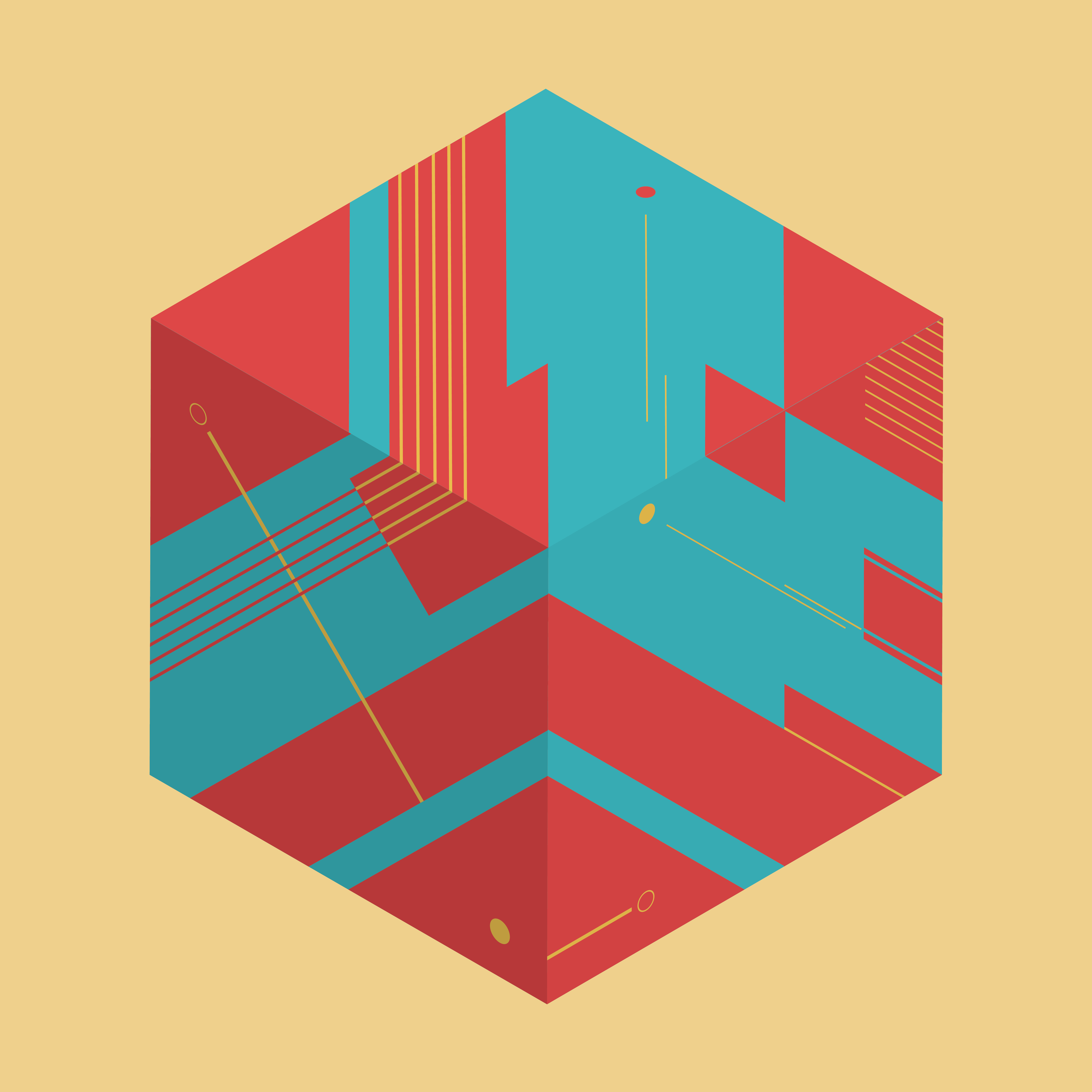
OBJECTIVE I
The goal for the first part of this assignment was to choose a realistic animal and create a graphic translation that effectively communicated essential characteristics that we wanted to be represented within our composition. The foundation of the creature itself needed to be created with geometric forms as well as the basic principles of design.
VISUAL RESEARCH & INSPIRATION
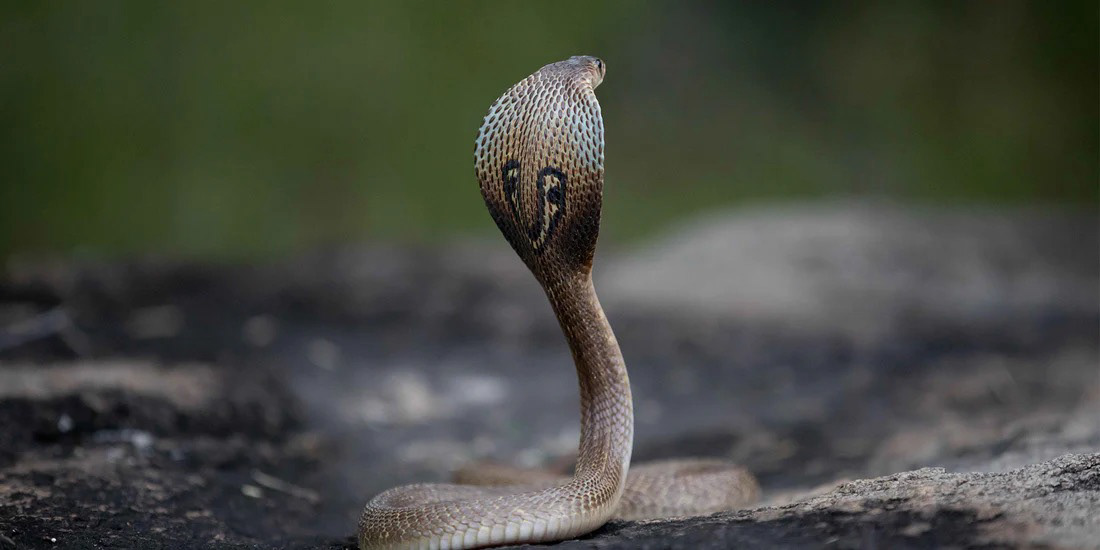
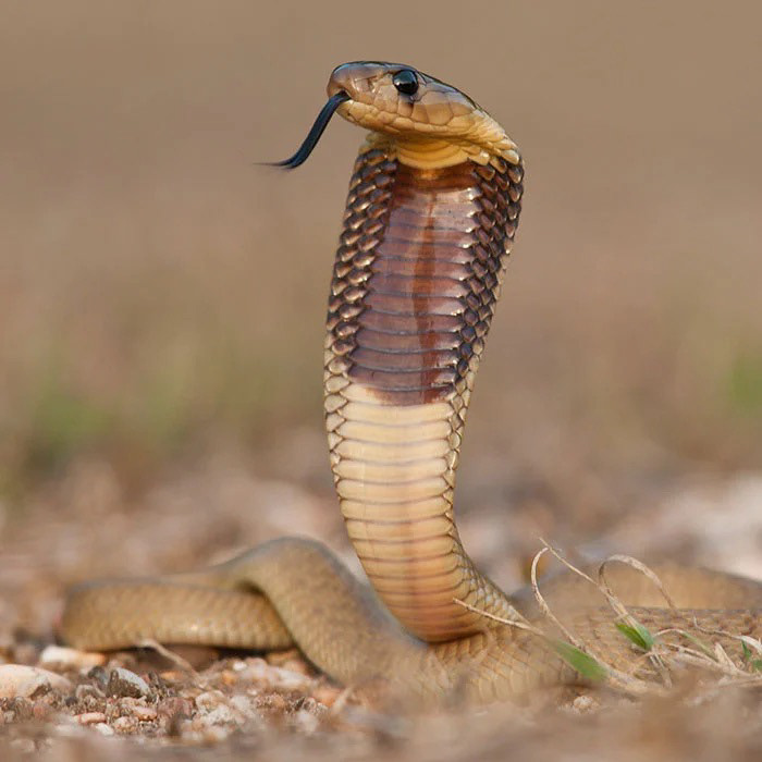
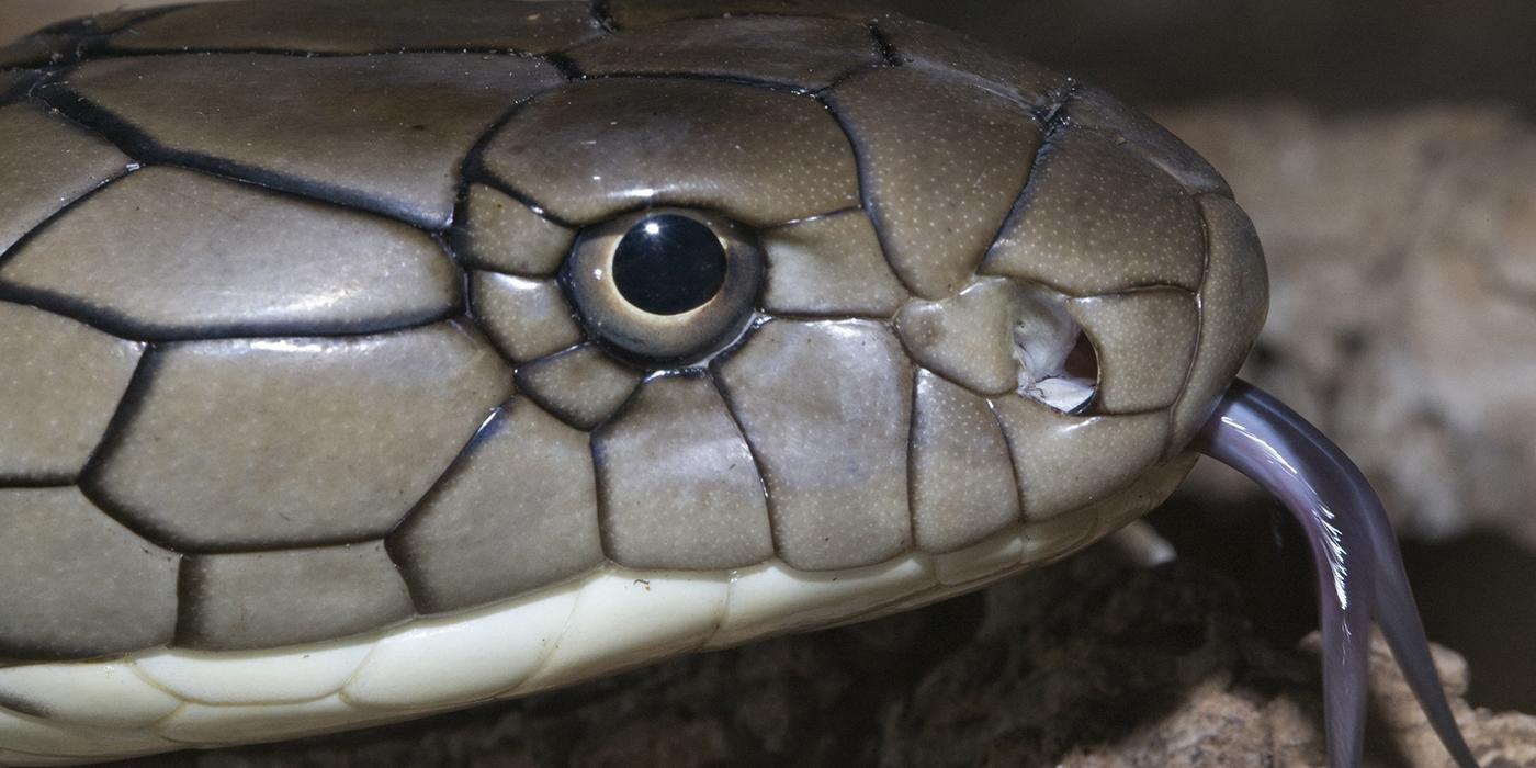
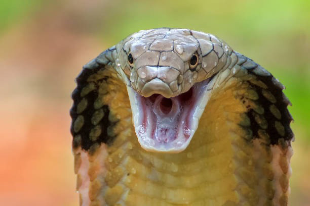
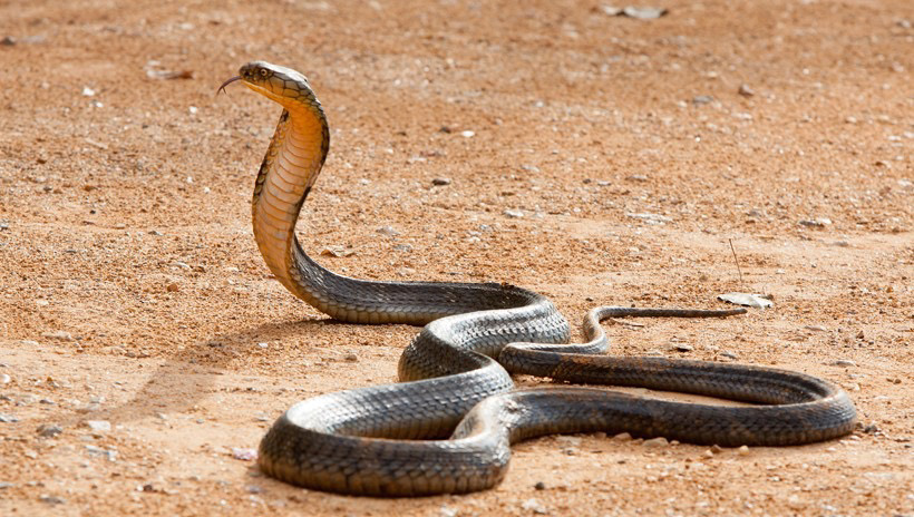
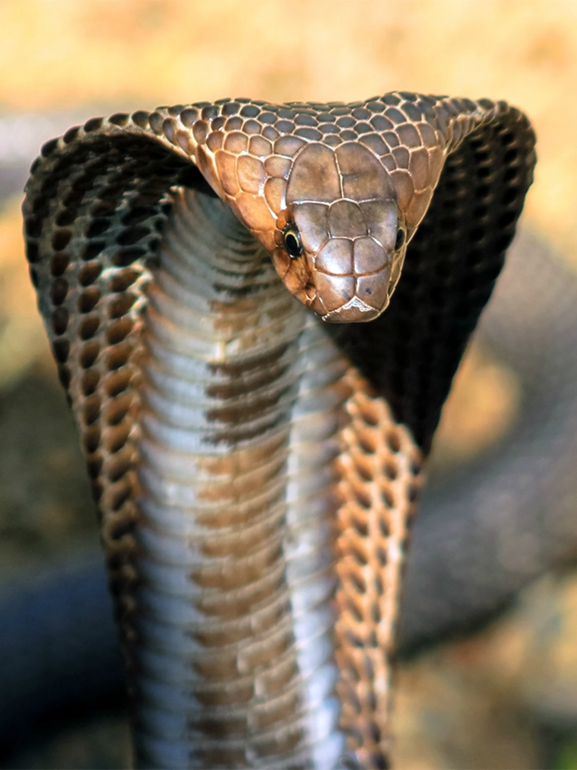
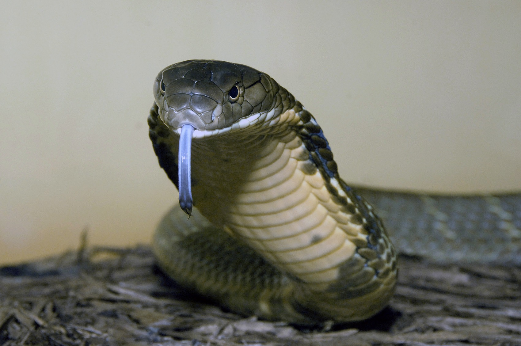
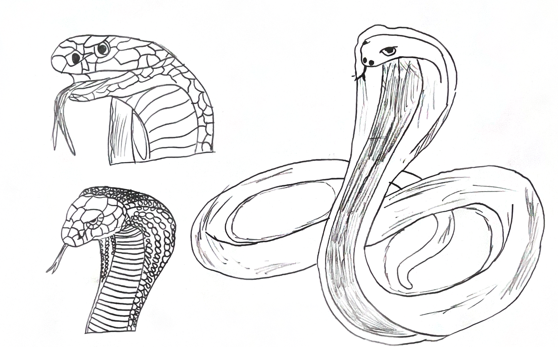
In order to get a strong understanding of the king cobra and before I could even start sketching, I had to review online images of these snakes. Paying close attention to factors such as angle positions, proportions, and details that would need to be included within the composition.
EARLY PENCIL SKETCHES
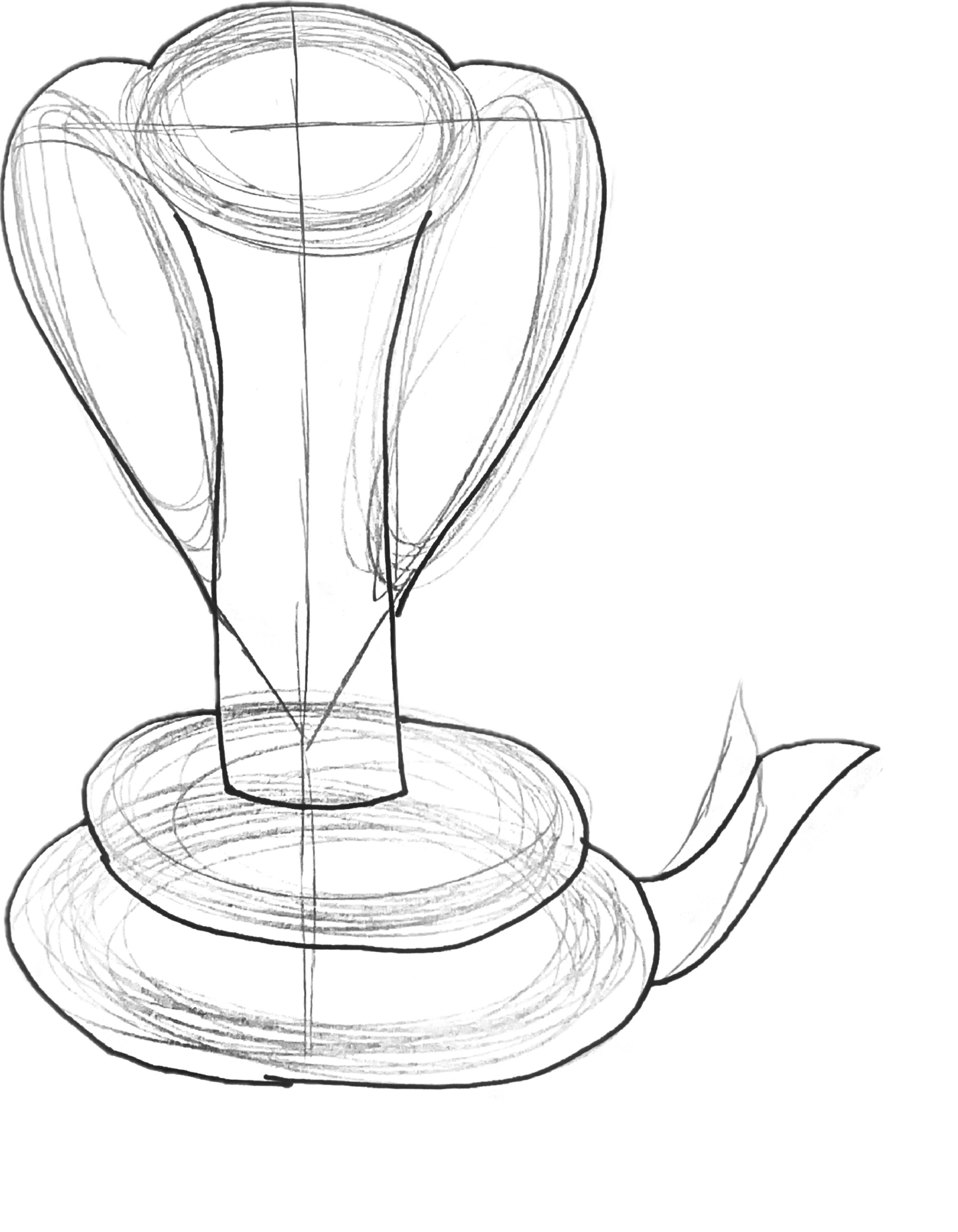
Starting out with sketches allowed me to become familiar with the overall shape and structure of the cobra. At first, the sketches were heavily detailed, but then progressed to focus solely on the geometric shapes that could be constructed within the overall form.
CREATURE ATTRIBUTES LIST
We were instructed to come up with both physical and associative characteristics to help envision how to construct the graphic translations of our creature.
DIGITAL IDEATIONS
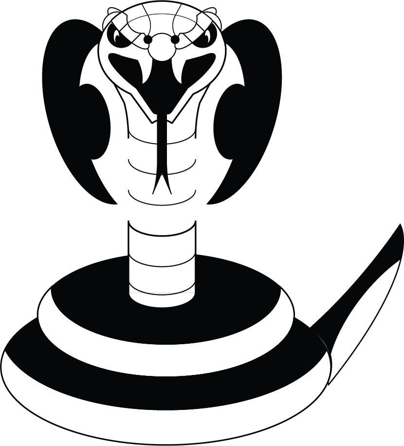
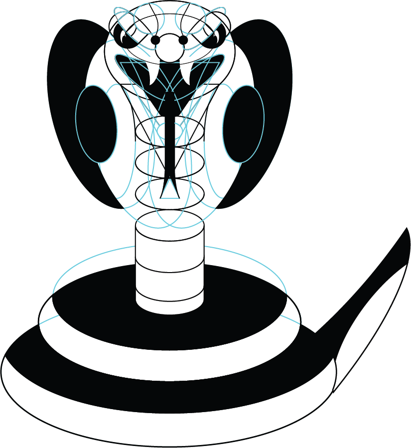
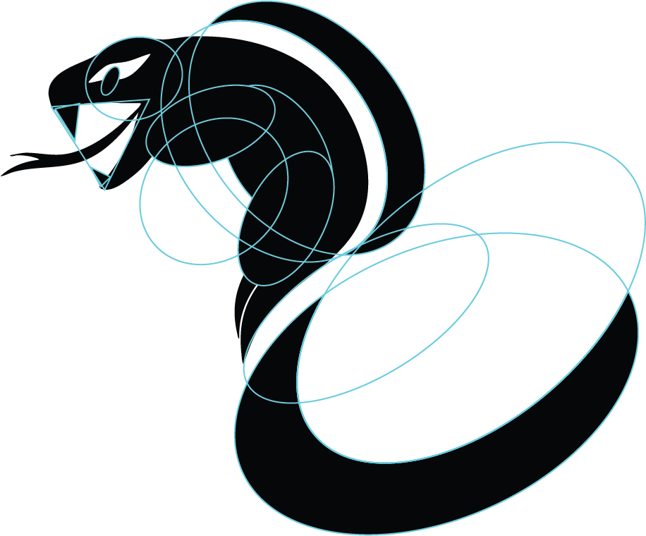
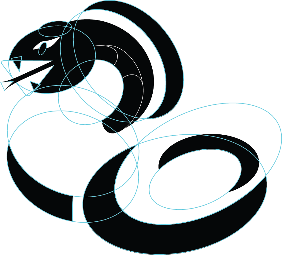
After spending some time sketching a variety of different angles and positions of the king cobra, it was time to construct digitally. As seen below, each composition was creating with geometric shapes to give smoother transitions and an overall coherent creature.


FINAL REFINEMENTS
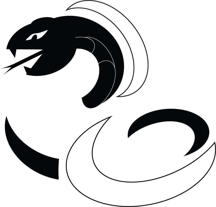
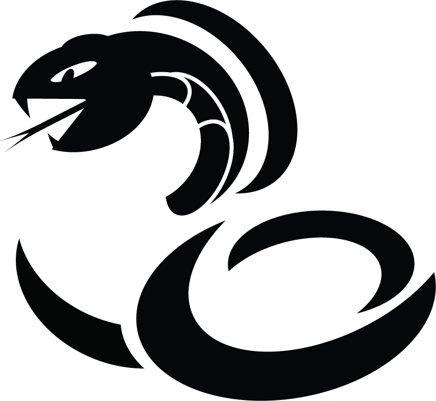
At the end of the process, I made smaller refinements to the king cobra. Changing the structure of the tail and adding a thicker stroke weight to the frontal part of the hood improved the composition as a whole.

FINAL CREATURE MARK
OBJECTIVE II
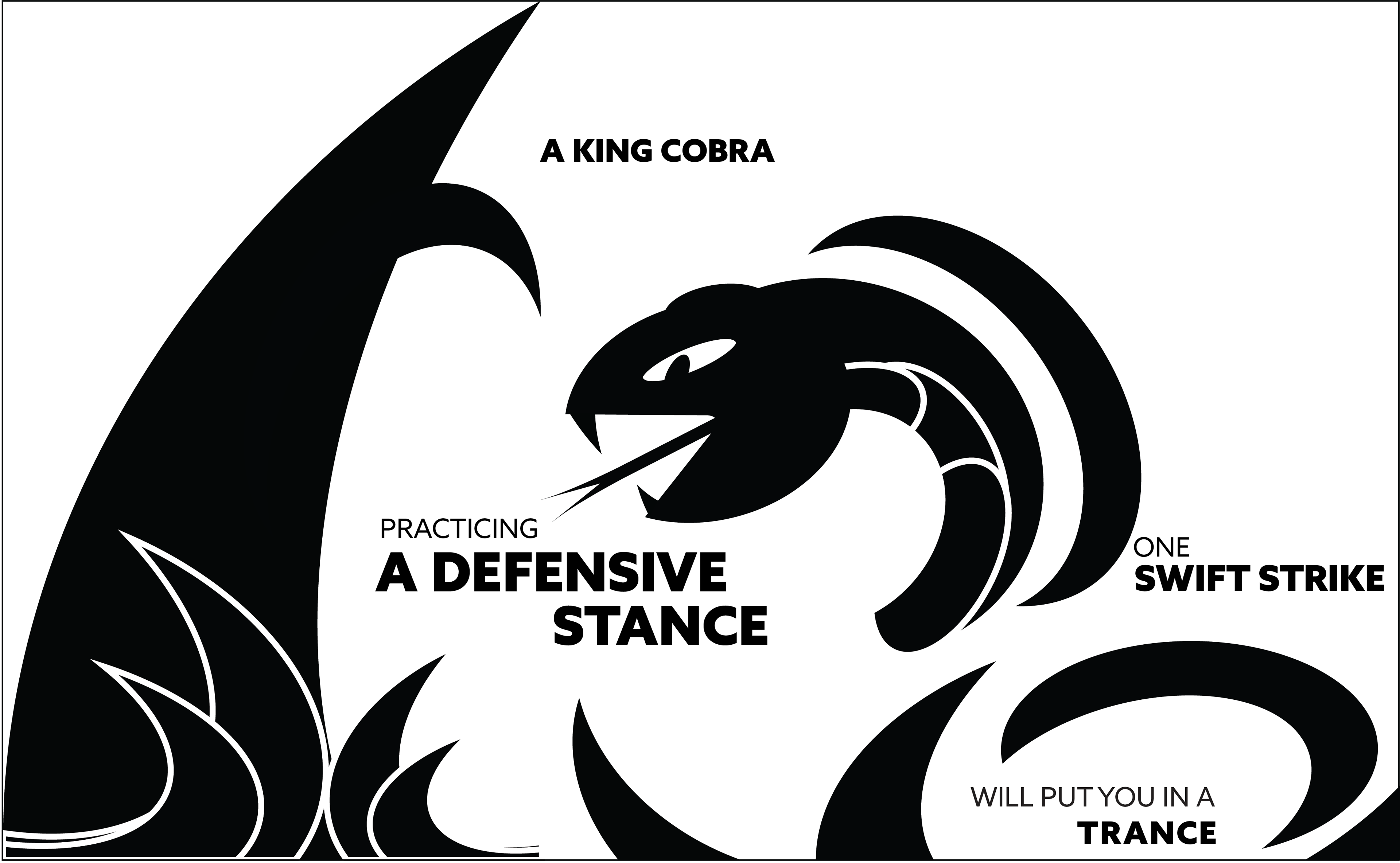
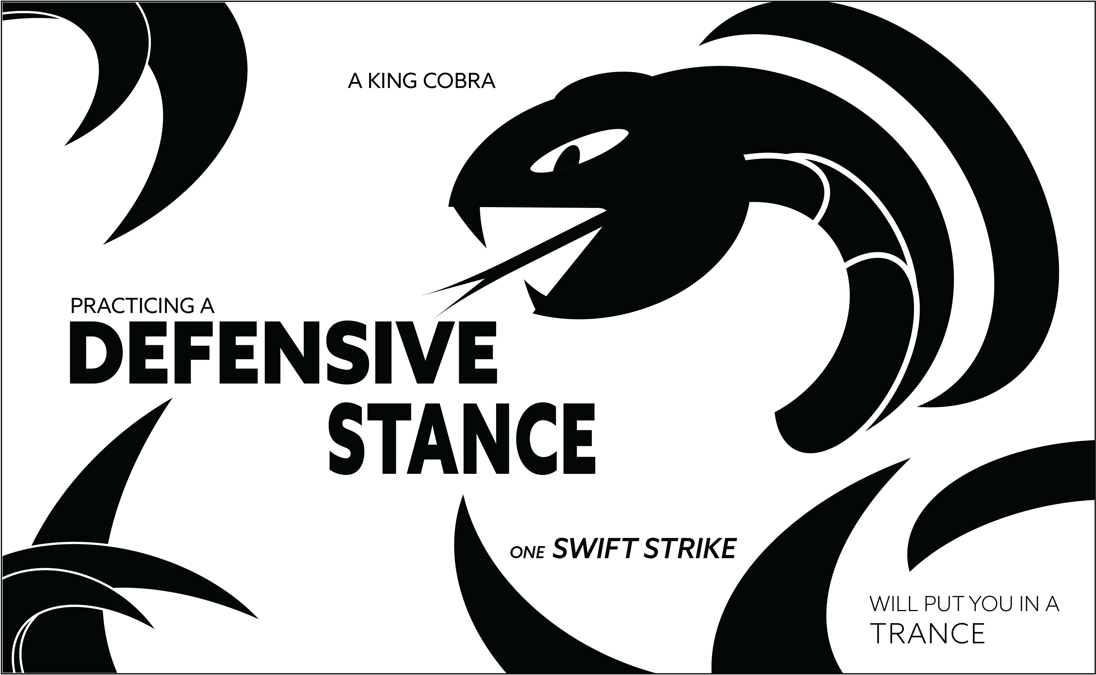
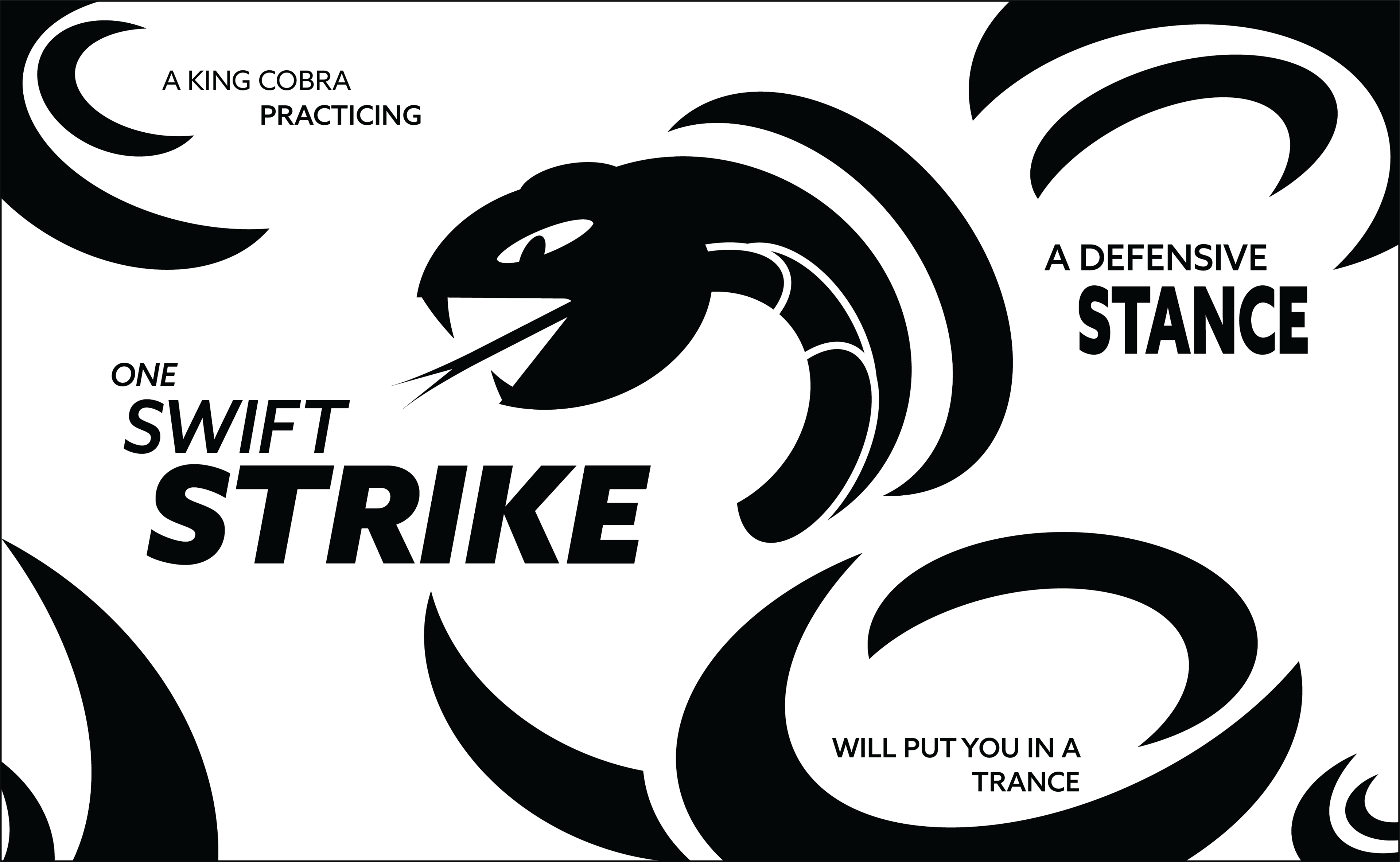
Continuing with this project, the next task to complete was adding typography and elements that coincided with the creature mark to create one coherent design. This would show the ability to include typographic phrases with design elements.
"A king cobra, practicing a defensive stance
one swift strike, will put you in a trance"
IDEATIONS (BLACK & WHITE)
COLOR INCORPORATION
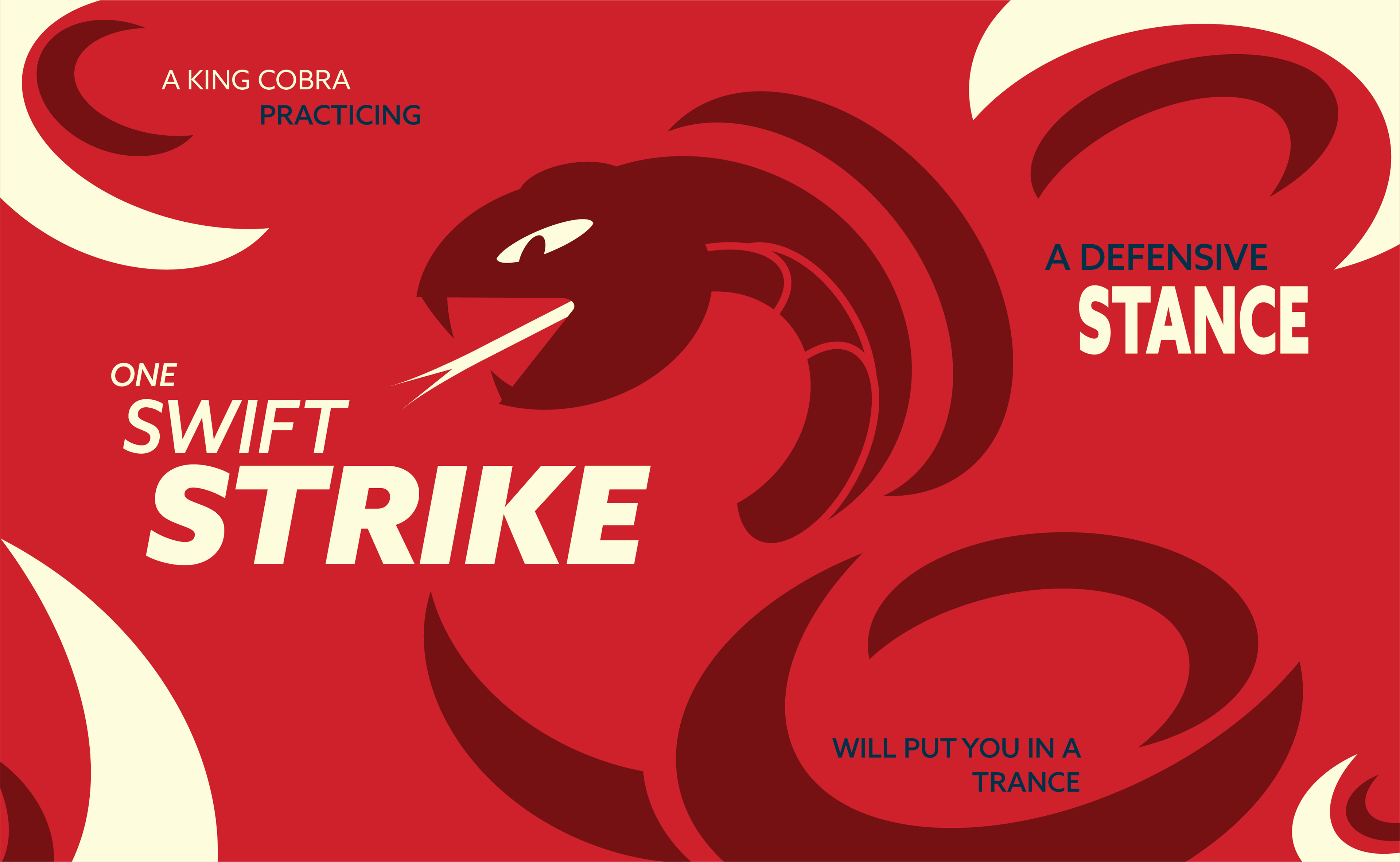
The associative characteristics I wanted to communicate the most were venomous and deadly as these are commonly affiliated with a cobra. The most effective way to communicate the danger aspect was by using a primary color harmony due to the reds and dark blues.
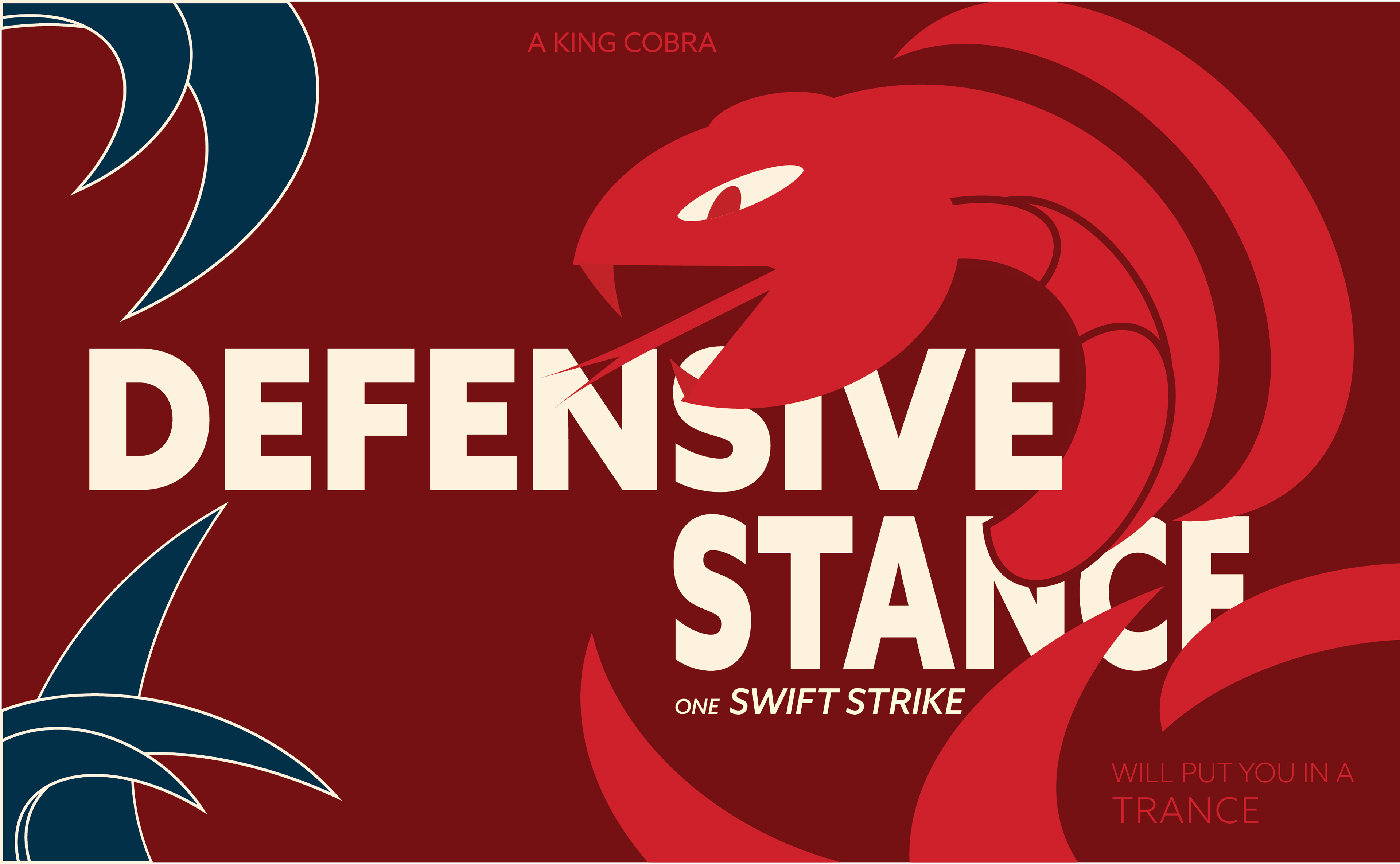
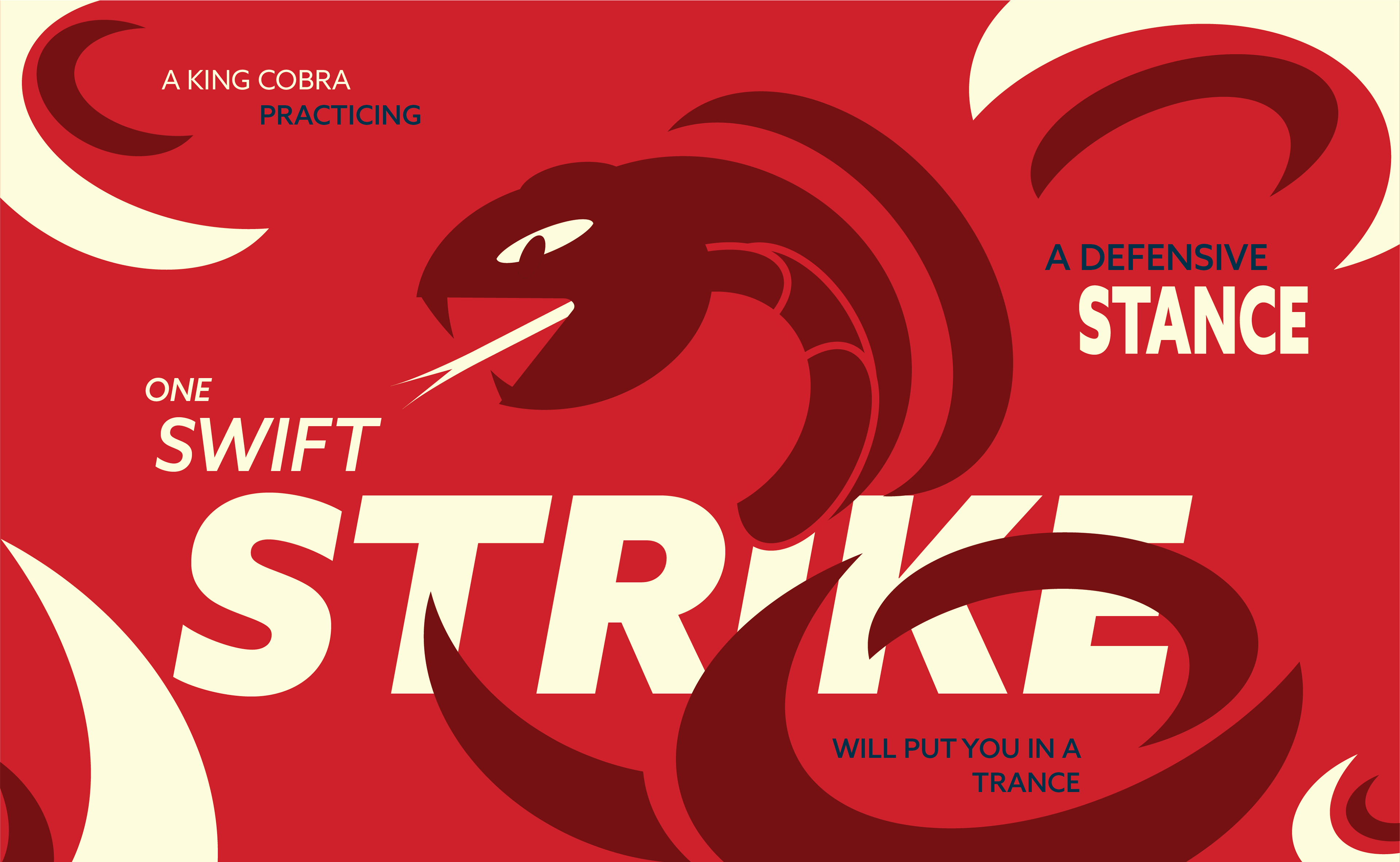
COLOR STUDY REFINEMENTS
The biggest critique given was to incorporate a more dramatic scale with the type rather than trying to fit it within smaller spaces. This drastically improved the composition and gave it a stronger visual interest.
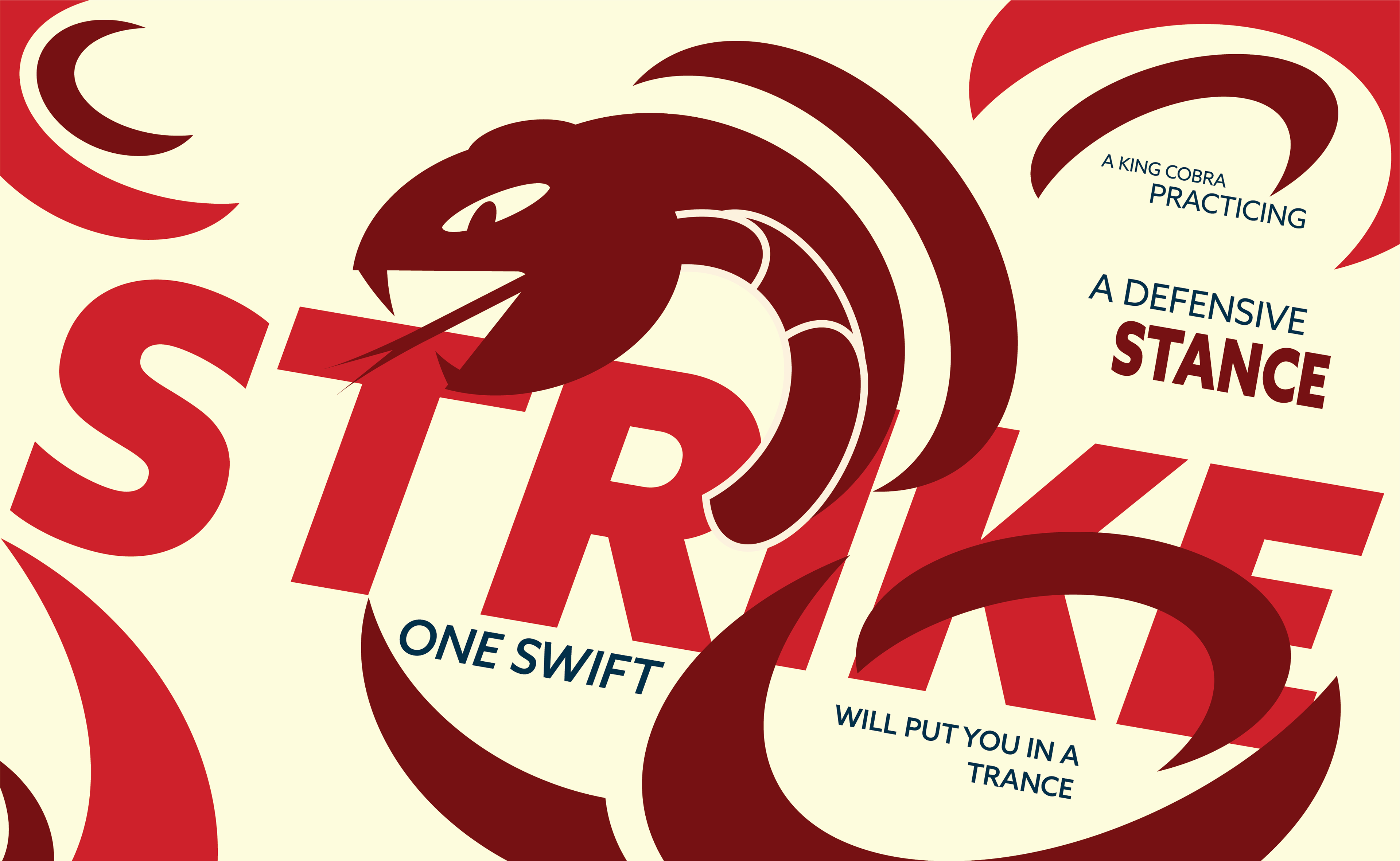
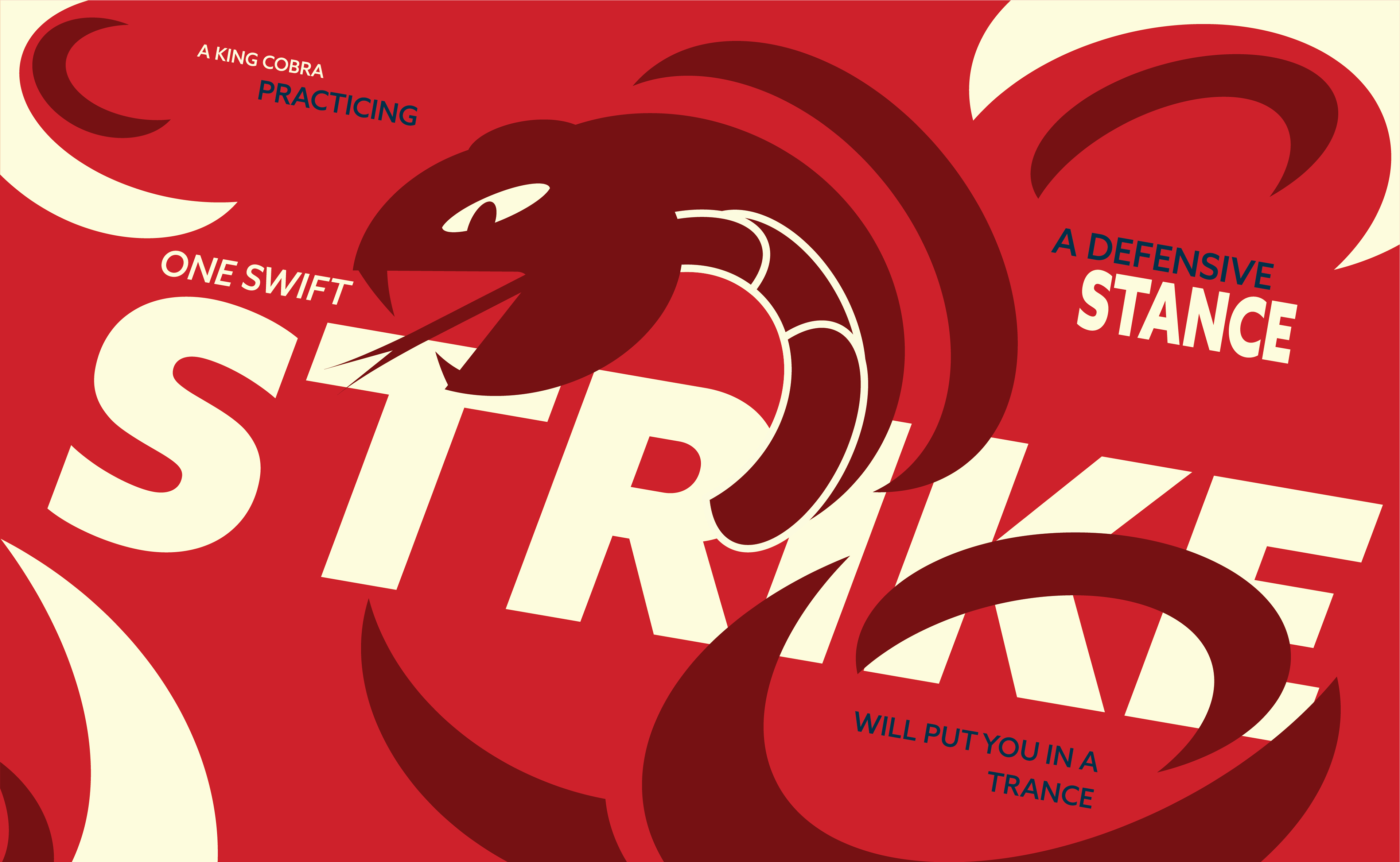
FINAL COMPOSITION
After changing the secondary text to be lowercase rather than in all caps and adjusting the hue levels of the blue, the typographic elements came through with a stronger structure and an overall more visually appealing composition.
