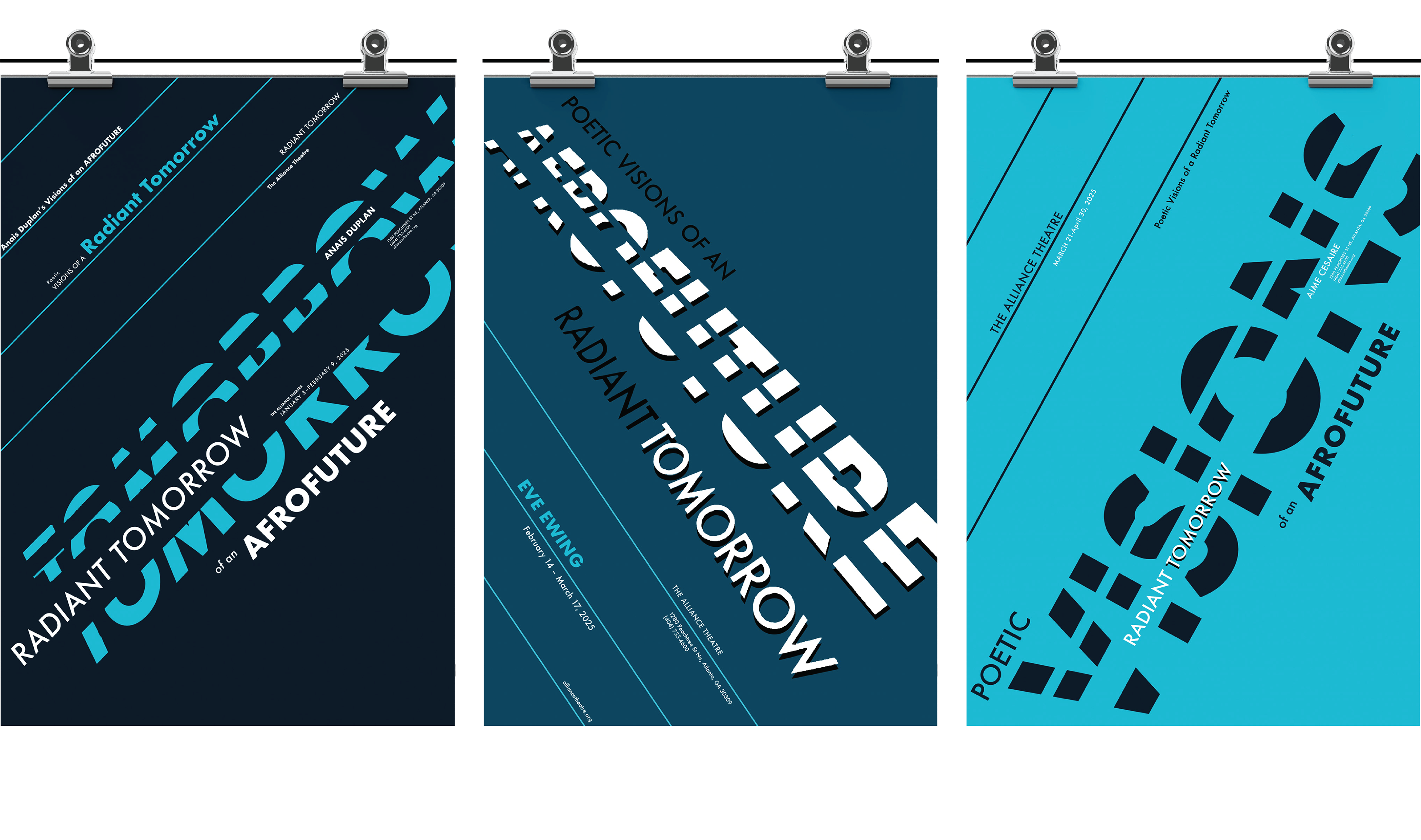
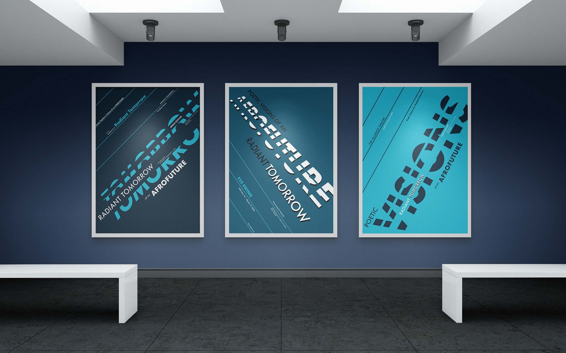
Radiant Tomorrow: Poetic Visions of an Afrofuture
Typographic Poster Series
Radiant Tomorrow is a poster design project that focuses on communicating information about afrofuturism, which is a movement in literature, music, and art featuring futuristic or science fiction themes with elements of black history and culture. A series of activist poets share their beliefs and representations, which will help my goal in to creating a shared theme across the three posters, while emphasizing the use of type as image.
Research
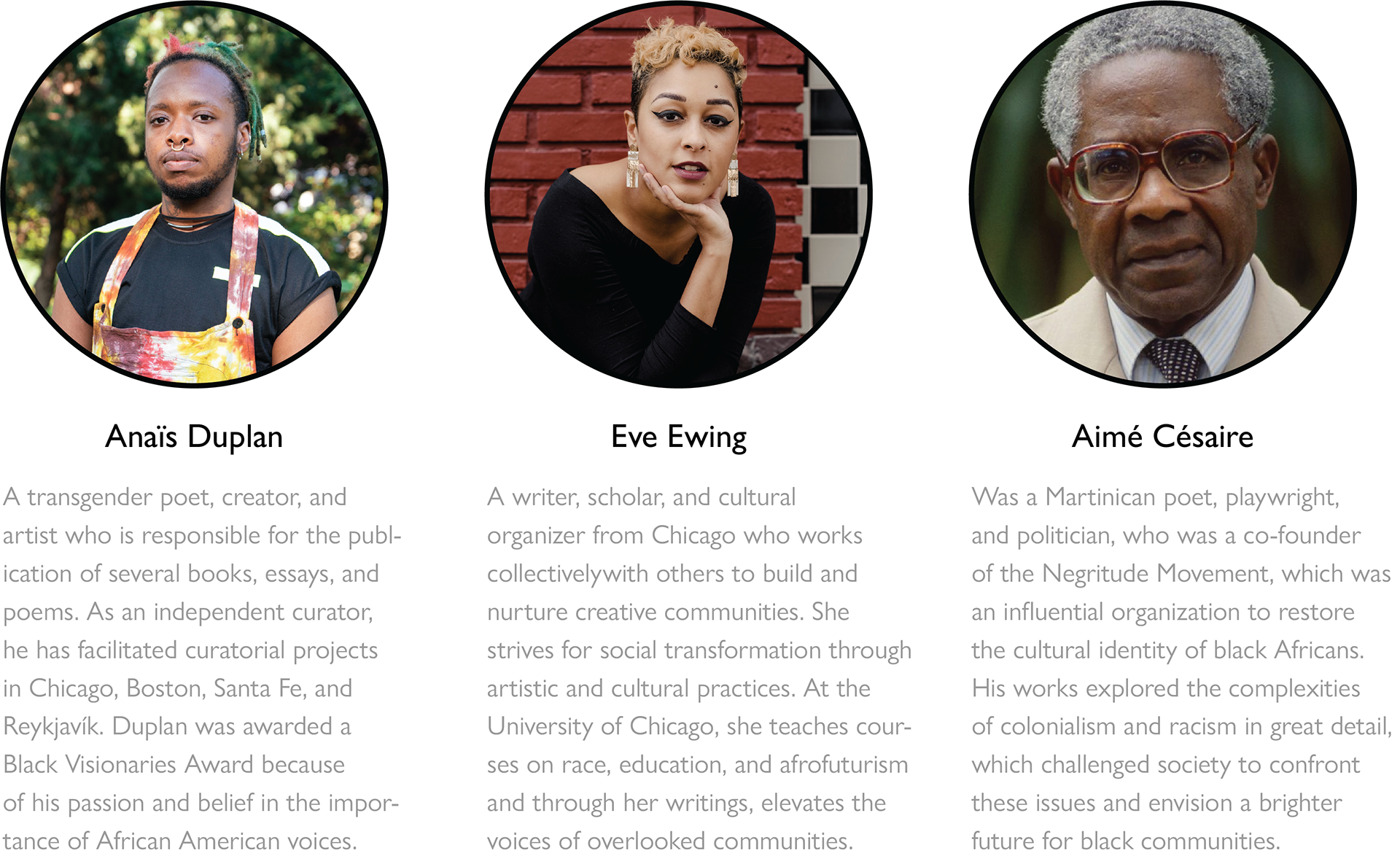
To understand more about afrofuturism and get a strong understanding of the main message that I wanted to communicate, I researched the life, backstory, and career highlights of the three different poets. While all three have their own unique stories, they are all interconnected based on the idea of afrofuturism.
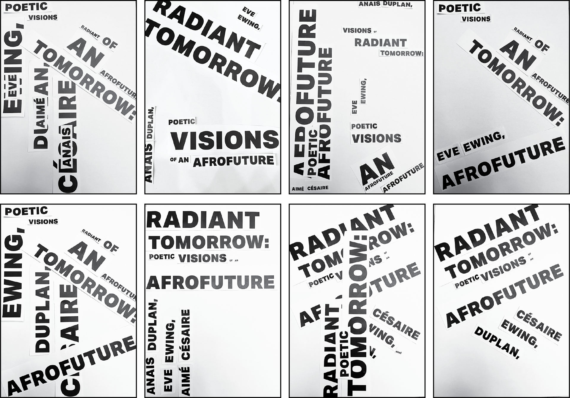
Earliest Layouts
The start of the process was creating a variety of text arrangements with different type sizes (shout, talk, whisper) that would help give an idea of how to potentially organize the text with the future posters.
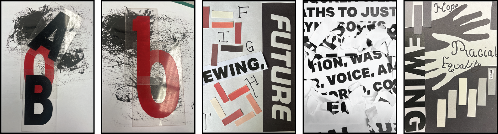
Experimental Freeplay
By doing this free play exercise, I could experiment with individual letters, colors, shapes, and text arrangements that would lead into finding an idea that could be used. At this point, posters were not in the picture, but rather a variety of unique designs that could be used within the series.
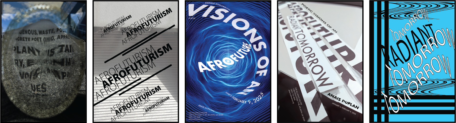
Digital Ideations
Bringing the possible ideas to the screen helps to add a visual interest and gets the concept I want to communicate closer to the end result. I am going for a futuristic style series that shows hope and possibility for the future. While afrofuturism may not be fully seen in most communities, black culture will be heard in the near future.
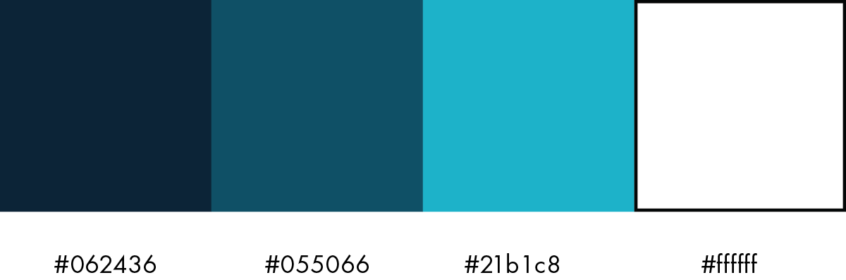
Typography & Color Palette
To portray the scientific fiction/futuristic series, I went with a monochromatic blue color palette and the sans serif typeface futura pt. The color would brighten across the three posters to show that the concept of afrofuturism is rising into reality.
Futura PT Book
abcdefghijklmnopqrstuvwxyz
ABCDEFGHIJKLMNOPQRSTUVWXYZ
1234567890!@%&()
Futura PT Medium
abcdefghijklmnopqrstuvwxyz
ABCDEFGHIJKLMNOPQRSTUVWXYZ
1234567890!@%&()
Futura PT Heavy
abcdefghijklmnopqrstuvwxyz
ABCDEFGHIJKLMNOPQRSTUVWXYZ
1234567890!@%&()
Final Critique
The biggest takeaway from the critique was that the poster series needed to be simplified in order to appear more as a complete whole. The first poster on the left had the strongest sense of unity and is the one that I needed to reflect in the other two. In doing so, the series would feel more unified.
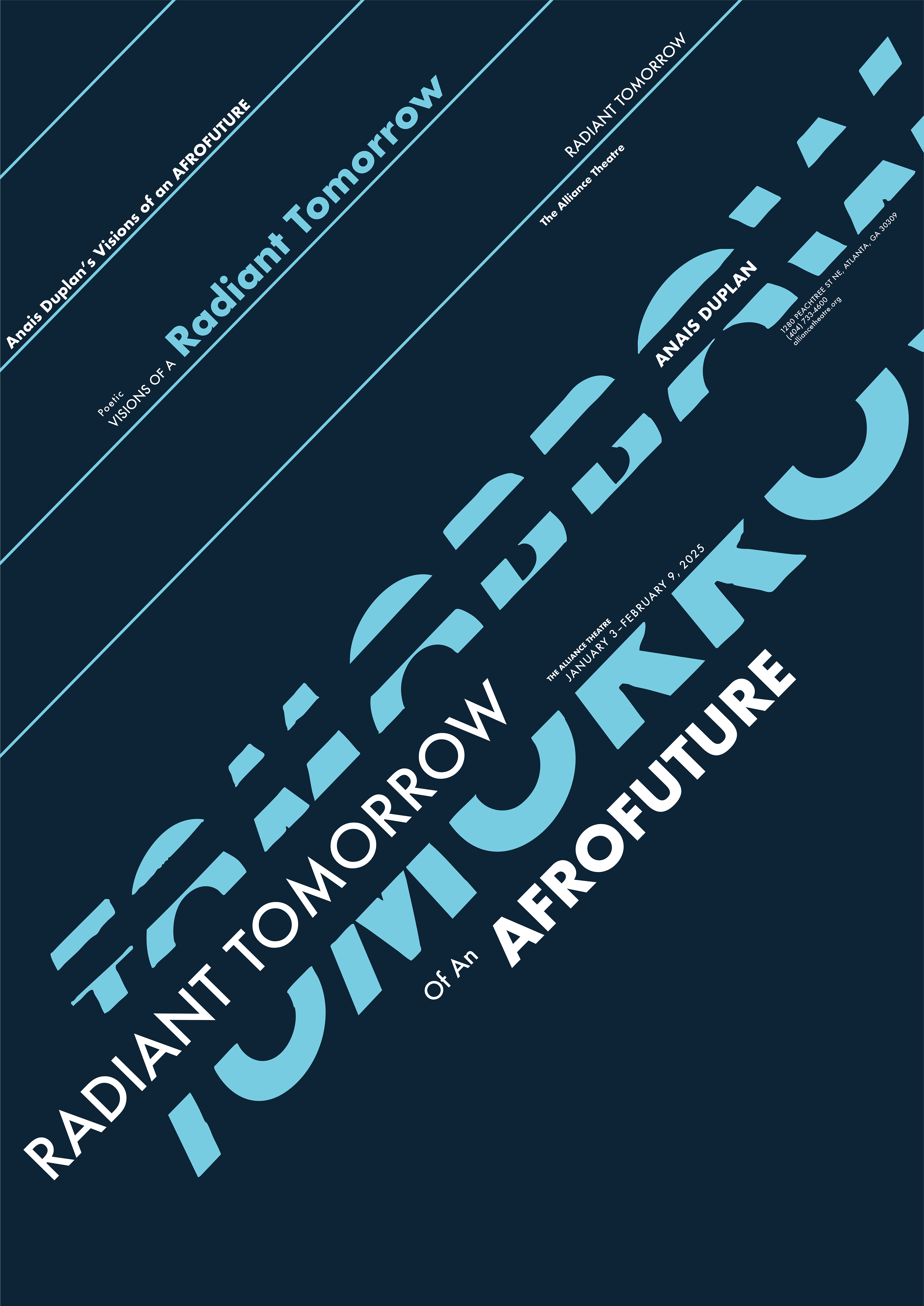
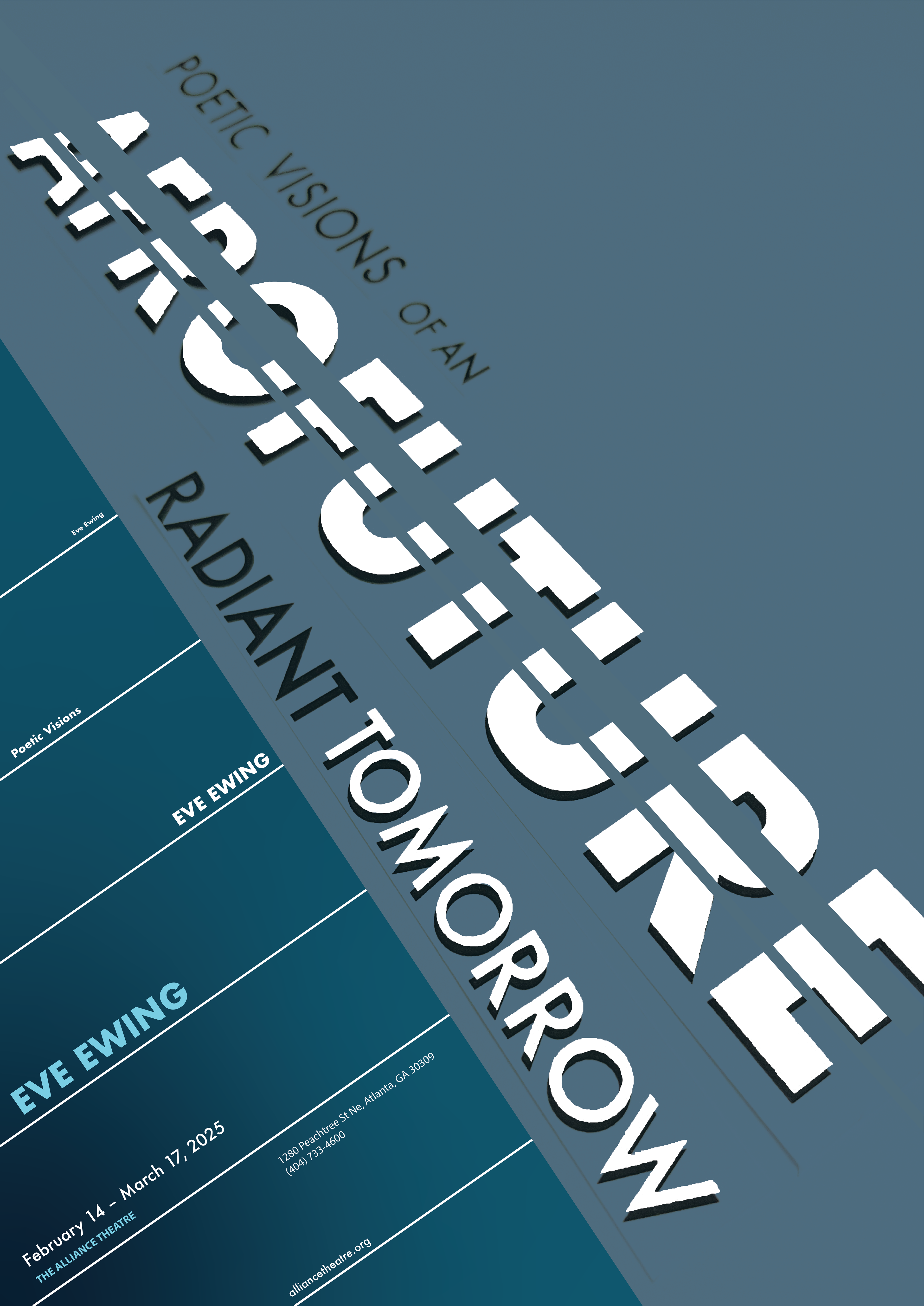
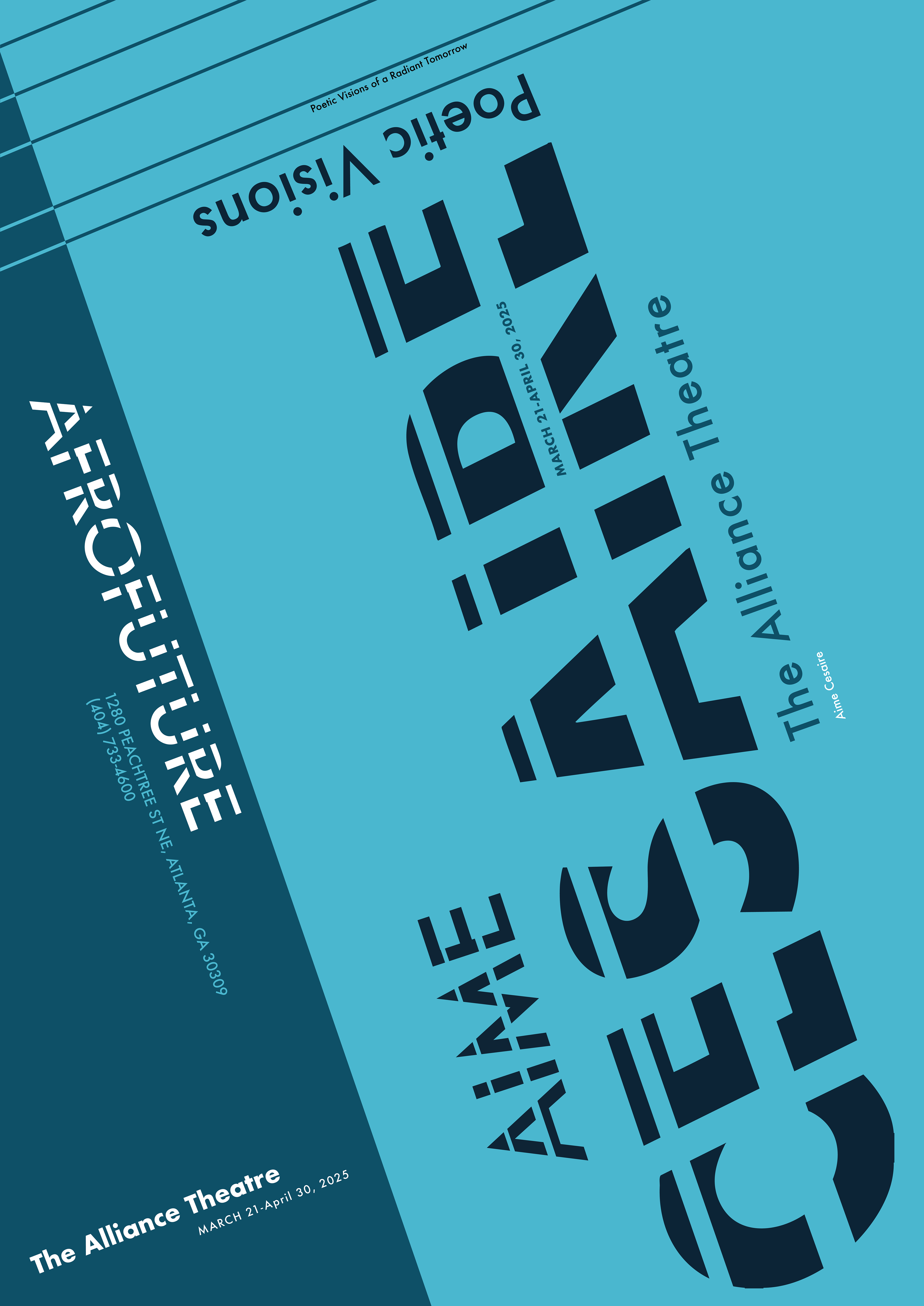
FINAL POSTER SERIES